1

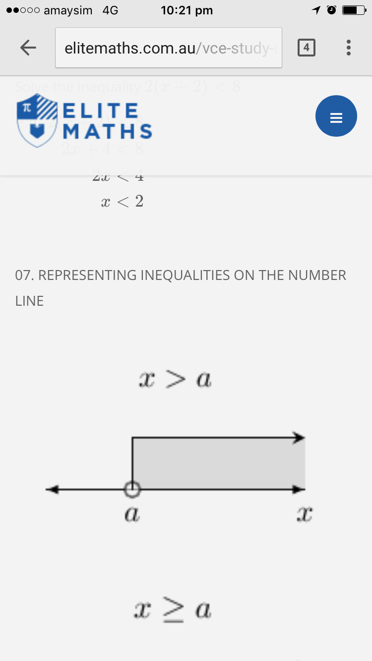
I noticed the above issue when I was composing an article in Joomla. The following is the uploaded image when viewed on a smart phone device which looks fine.

smart phone view

However, the web version looks very stretched. desktop version
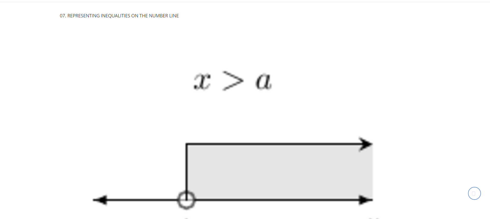
Ideally, I do not want any re-sizing for desktop version. How do I acheive this? Please help Joomla experts.

Thanks.
1 Answer 1

2

You can easily achieve this with some custom css overrides made within your template css styles. Use media queries to adust images width to user's screen size. You may try this code here:

/* For width larger than 400px: */
.your-image-class {
        display: inline-block;
}


/* For width 400px and smaller: */
@media only screen and (max-width: 400px) {
    .your-image-class {
        display: block;
        width: 100%;
    }
}
1
  • Ah! Thank you :)
    – Will Kim
    Commented Jan 28, 2017 at 23:37

Your Answer

By clicking “Post Your Answer”, you agree to our terms of service and acknowledge you have read our privacy policy.

Not the answer you're looking for? Browse other questions tagged or ask your own question.